BRAND IDENTITY
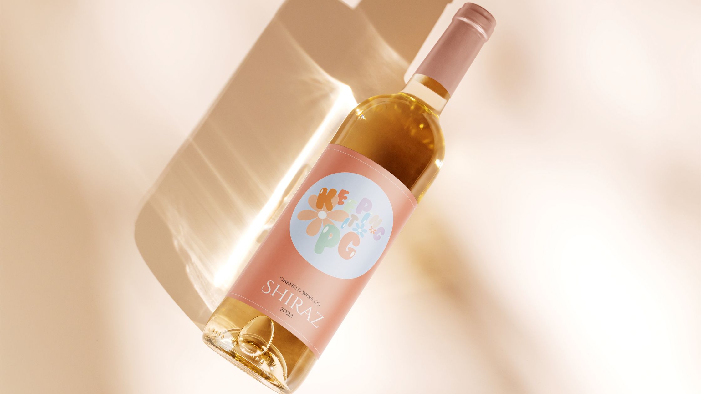
The purpose of this brand is to create something that people resonate with, steering away from the ‘boring’ labels and bringing in bright colours and fun typography making it stand out.
Provide consumers with a new vibrant bottle that not only looks aesthetically pleasing but is also sustainable and environmentally friendly.
We envision a sustainable product that reduces its environmental impact mainly within the transportation phase. We also want the label to evoke joy, humor and color.
Environment
Bringing people together
Sustainability
Community

BRAND Development
The moodboard reflects bright colours, fun shapes and interesting fonts. I wanted the brand to be memorable and stand out on the shelf so I have decided to go bold with my label design and create something that will catch the eye of the consumer.
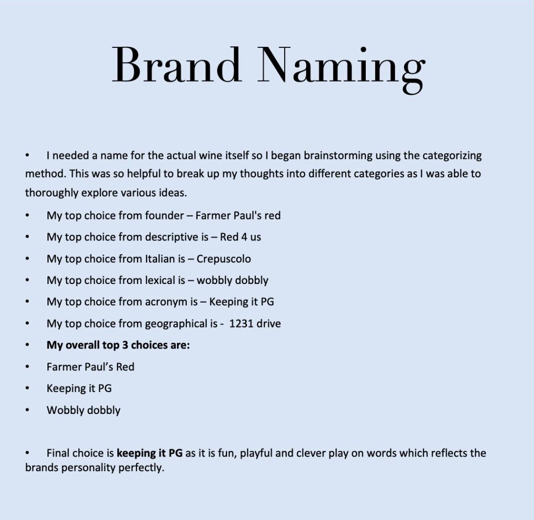
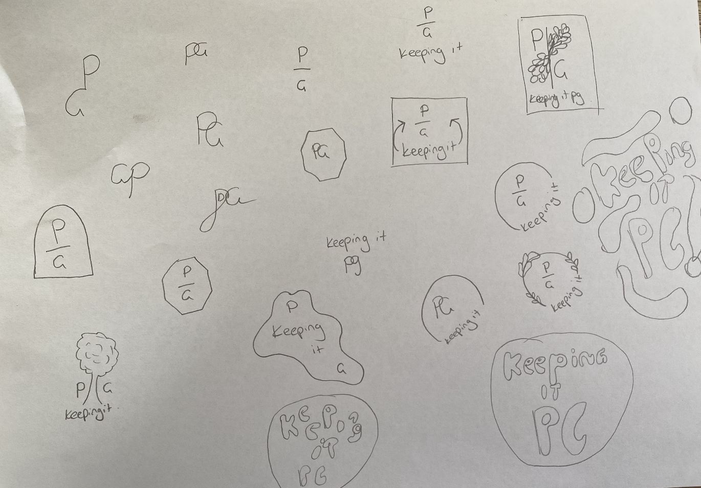
The name ‘keeping it pg.’ was inspired by the founders of the company using their initials p and g as the main component of this name. I also wanted to keep the name light, cheeky and memorable so it stands out to consumers and represents the brand.
The brand is different, colourful and fun, I feel the name fits perfectly with the theme of the brand.
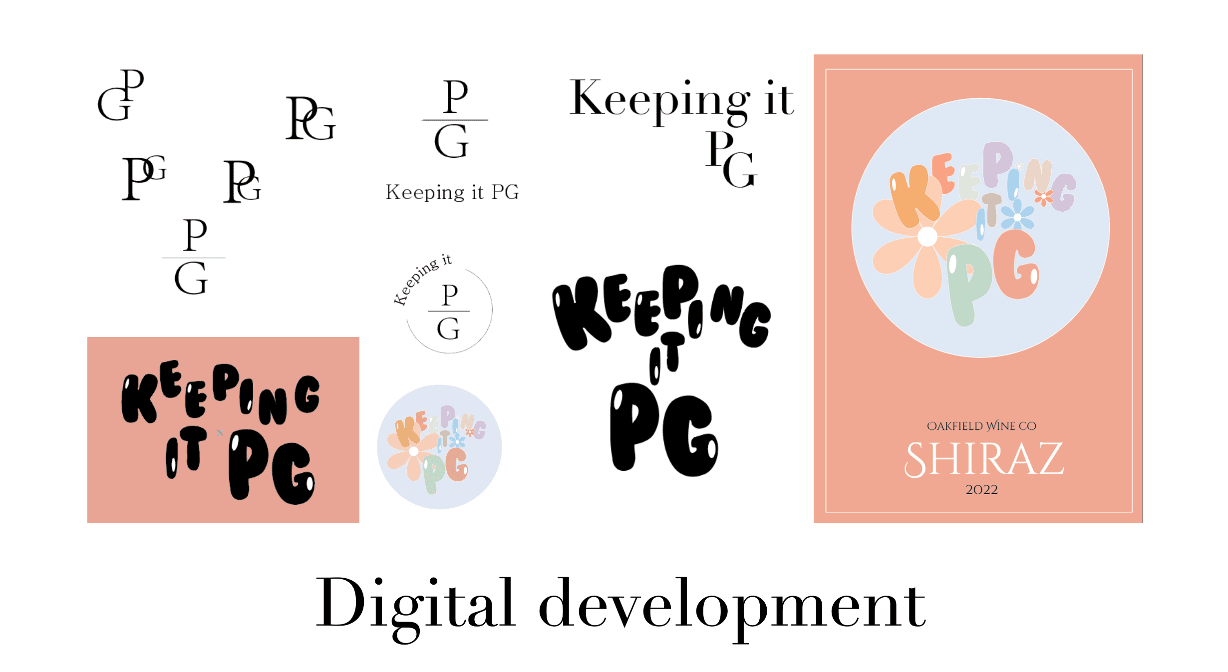
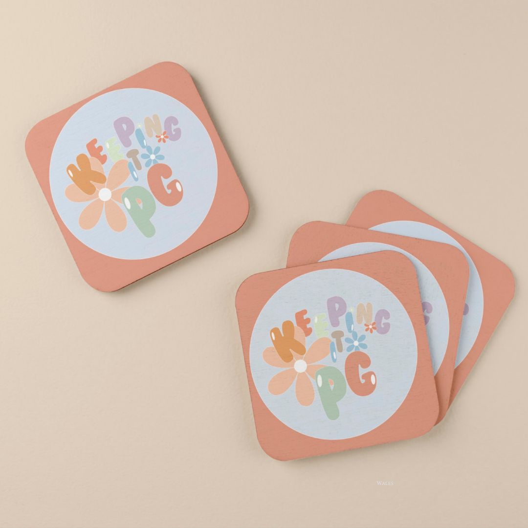
I began working with the letters P and G to find something that worked, however nothing was really standing out to me. I had this idea to use bubble letters which I liked the look of during the thumbnailing process. When I digitalized it and played around with the font and the way it flowed together something clicked and I could suddenly visualise the logo. Once I had laid out the letters in the way I liked I found a colour palette on coolers.co that used bright fun colours to express the brand. My final logo matched my moodboard perfectly and reflected the brand in the way I wanted it to, playful, cheeky and unexpected.




PACKAGING
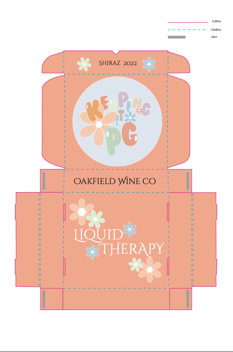
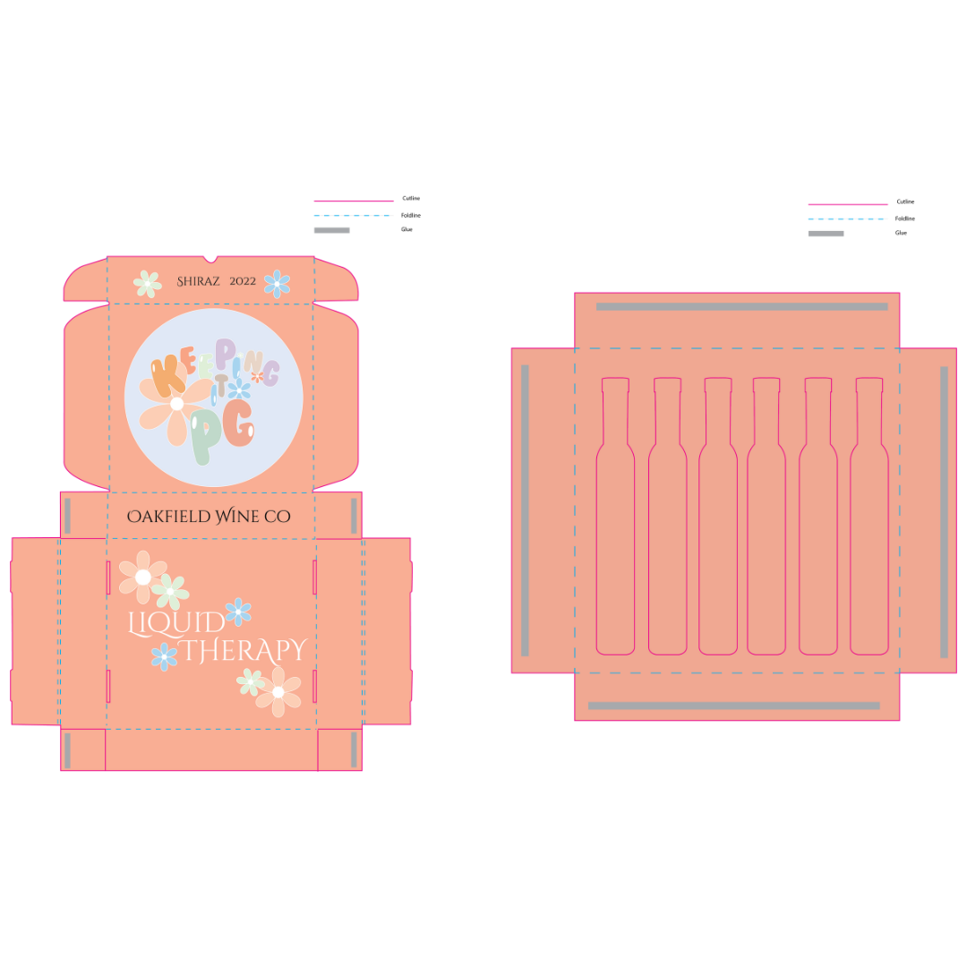
My final packaging solution uses 100% recyclable cardboard for the box and inner tray to store the wine bottles. It also uses PET material (Polyethylene terephthalate) for the flat bottle which can also be recycled and has a reduced carbon footprint.
This packaging is designed to fit more bottles into the shipping box. For example this packaging fits 6 flat bottles in the same space it would take to fit 3 normal circle bottles. This cuts the shipping costs down by half in this example.
This packaging is designed save on shipping costs and its environmental impact as well using recyclable materials. It also serves its functional purpose as a packaged box protecting the wine inside.
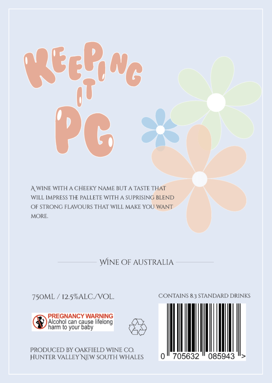
This packaging is very straightforward and easy to use. It works much like any other wine packaging in the sense that the box contains and protects the wine until it is ready to use or pack away into a cabernet. All required information is on the bottle for easy access for the customer.
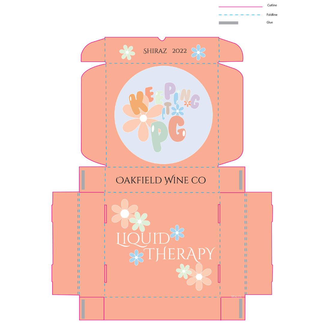
packaging development
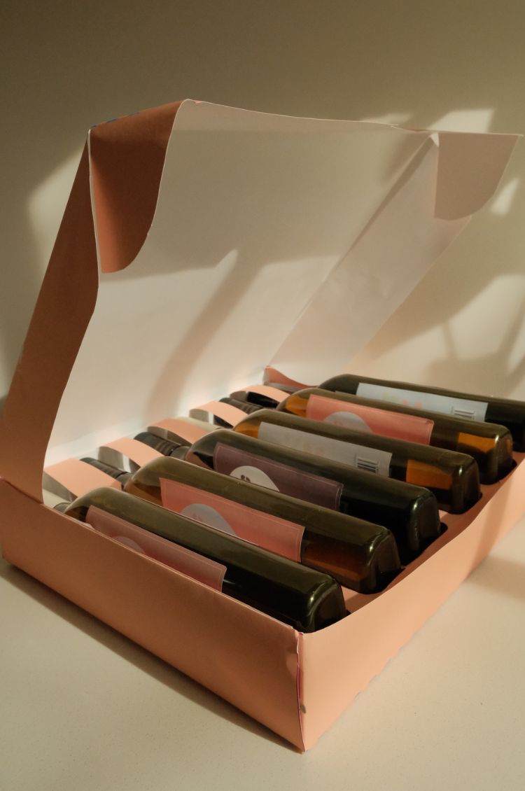
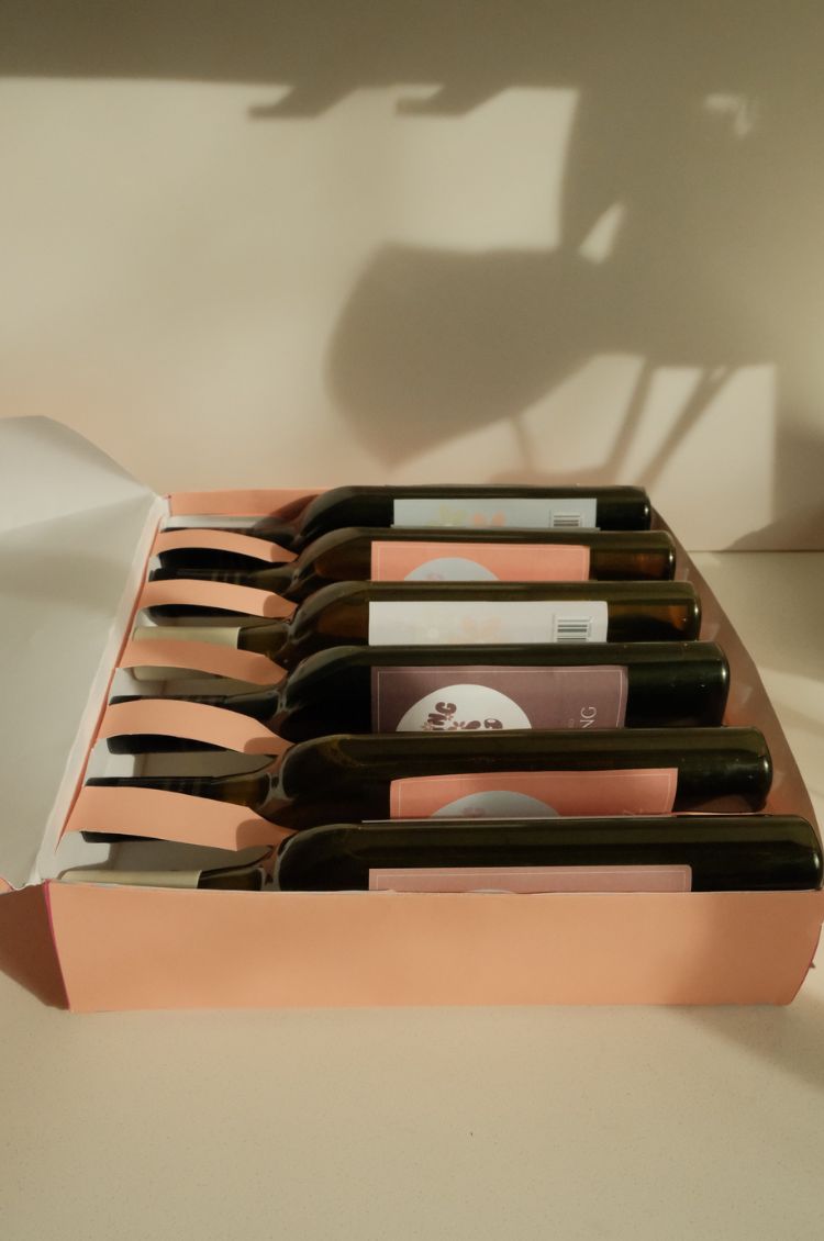
For this project an environmental solution for packaging for wine bottles was required.
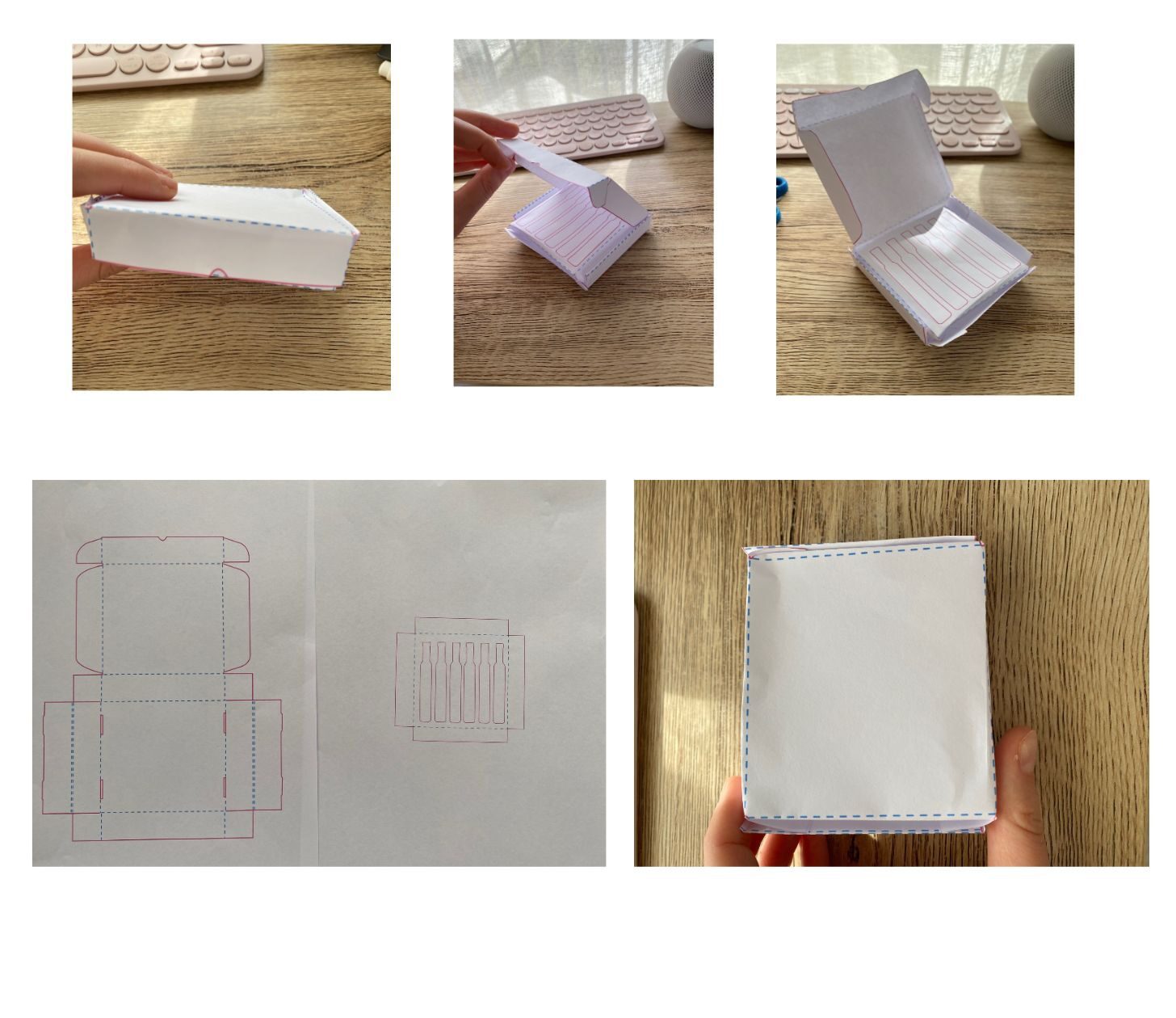
The hardest part of the prototyping stage was printing the inside tray die line to the correct size to ensure it fit inside the box when it was put together. This was a very helpful exercise as it gave me perspective on sizing each packaging element. This process gave me a strong idea of how the final product would fit together and work like effective packaging.
